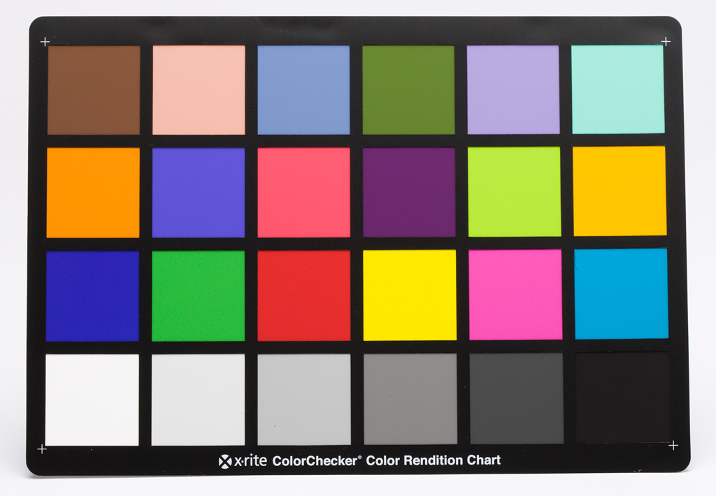
Last week I received my X-Rite ColourChecker color rendition chart and shot it in my productphotography setup. When you match the colours of the squares with the values stated in the manual your photograph becomes rather pale / dull. When matched up there is no dark black nor is there bright white, the histogram has no values at both ends, very little contrast.
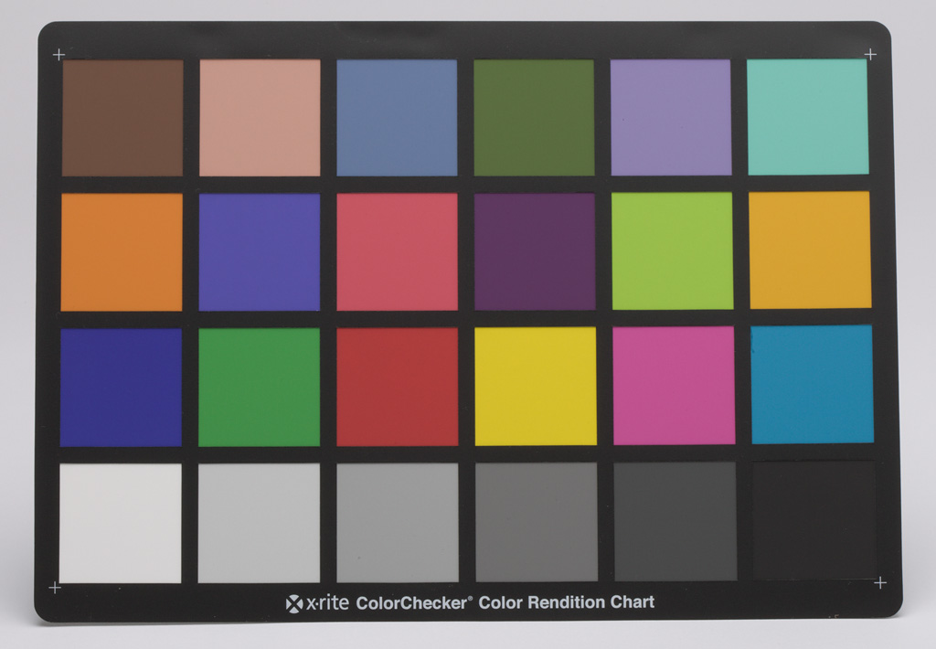
The products shot with this very neutral setting look surprisingly good after cutting them out (with the pen tool). This neutral setting ensures there will be no clipping colour channels, when you increase contrast using curves the colours change. I knew that already but it is still very insightful to see it happening on your screen: because every colour is a combination of the three channels (RGB) as read from the sensor and tweaking the contrast changes the balance between those channels for any colour that is not neutral (grey, from bright white to deep black), the colour changes, the more it is away from neutral, the more it changes. There’s even a risk of clipping one channel (especially with red and blue). We all have photographed the red traffic light that looked orange because the red channel was overexposed (clipped). Here is a version of the X-Rite ColourChecker with slightly more contrast, I tweaked it so there would be almost black and almost white. Look at how the colours shifted… Of course I understand that brighter colours are more attractive.
