My way of dealing with colours has always been: set everything to neutral and you get what you see. Let the professionals (manufacturers…) handle the details. I can see how you calibrate a product-shoot-setup (and I have done so in the past, with variable success), but everything else: nightmare. Hence:

- I trust the camera maker to transfer the information that falls on the sensor as truthfully as possible to their digital raw file, they have more R&D people and measurement equipment than I do. So: no camera profiles, just dial in 5500K and you have the light that you shot. If your scene was under a yellow streetlamp, than your photograph looks yellow. Duh. That’s what I want.
- My display is an auto-calibrating EiZO (colour table is programmed in at the manufacturer), when I bought it I noticed it was kind of “cool”, bluish, but I liked it and so didn’t “do” anything to it. I have the cap lined with the felt and the gray wall behind it and everything and I work in tempered white light (led). But don’t forget: your eyes always correct for color casts, so even if (and only íf) my EiZO were, in fact, too blue, I could still see (and I feel I did actually see) all the other colours perfectly, relative to their slight bluishness, if even.
- My favourite print-people have their printers calibrated and maintained by the manufacturer (Epson), I trust they print neutral. And Hello: everytime I get a print back, it is exactly as I expect it to be, as I remembered it from, sometimes hours of editing on, my EiZO. Of course it is darker than my display when compared directly (while working it is most comfortable when the display is slightly brighter than the surroundings) and some bright saturated colours are subdued. This is obvious because paper can hold less colours than screen and it isn’t backlit (unless your name is Jeff Wall). But here the autocorrection of the eye immediately sets in as well, as I check a print at my printers (so, without looking directly at my screen at the same time with my other eye) I cannot tell what colours have been “altered”, everything looks relatively in order. Of course I know that especially bright saturated greens get a bit desaturated, just look at the colour spaces &c.
So, enter the calibration (Fotoacademie lesson #234). What we have to calibrate and the methods to do it:
- Camera sensor, with: Adobe DNG profile editor (free).
- Display, with: Spyder 5 Pro or equivalent (not free).
- Printer + paper (for each combination a new profile is necessary), with: spectral meter (not free, unless you can borrow one or are studying at the Fotoacademie where they have one) (apparently one wants to correct for specific characteristics of paper, in lieu of just getting the paper with the best color reproduction).
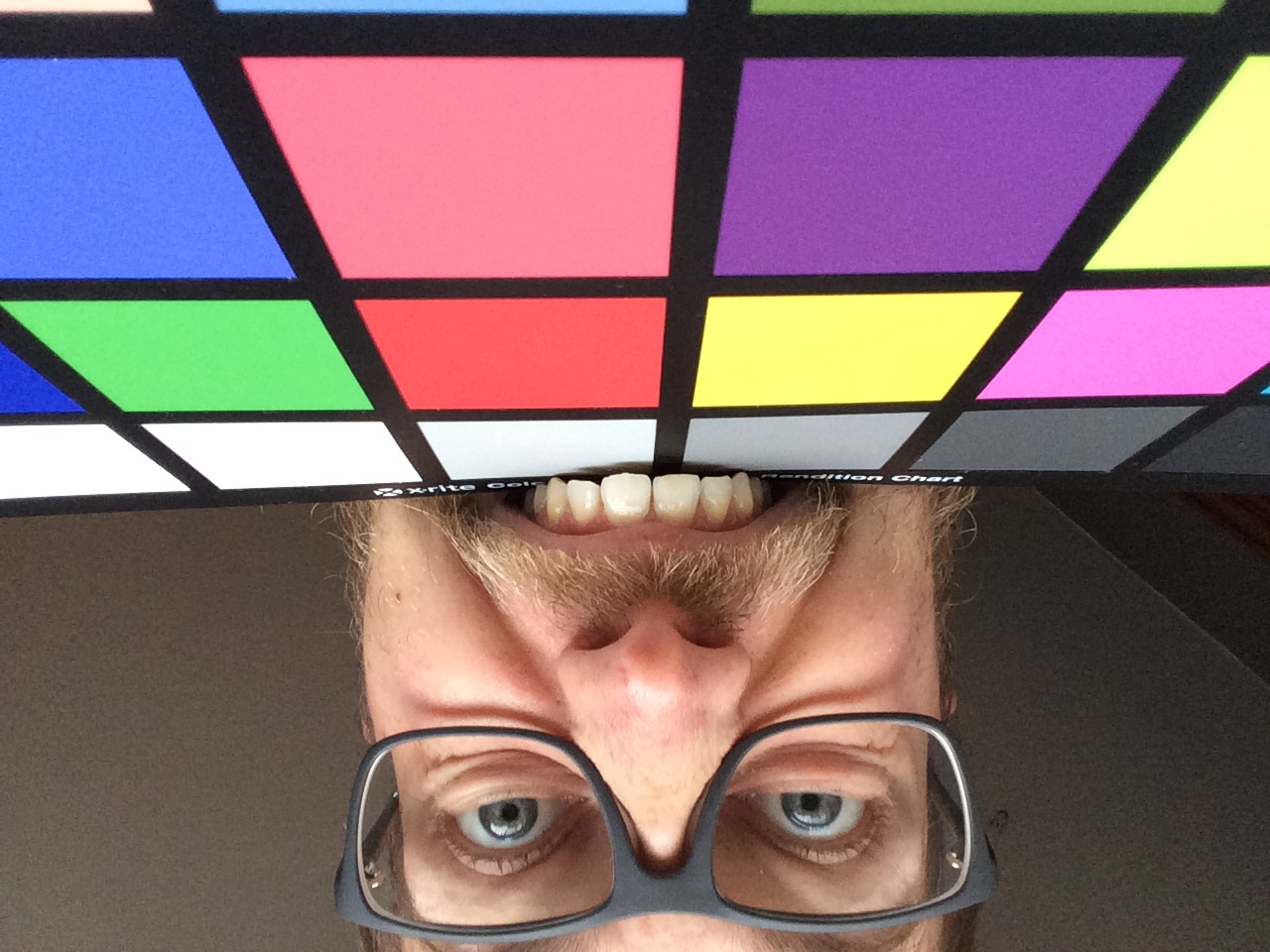
Because of my lack of trust, I first make a print as a “before” reference (shoot the card, photoshop to neutral, print it as is). For me, the problems start with the taking of the photograph of the color checker card (I have an X-Rite colorchecker). You should do this in neutral light: overcast weather, no coloured objects near the card (so a large concrete square is ideal, which I have a lot of in my neighbourhood). Blah-blah, of course this is all very nice but
- The one overcast weather is not the other overcast weather, and colour also changes during the day. Shouldn’t we
- Shoot the colorchecker using a (manufacturer-calibrated at 5500K, since that is supposed to be “white”) studio light or flash?
- Shoot in daylight (with a wide spectrum) while _measuring_ its actual color temperature with some tool and use that measurement during the subsequent steps (in stead of just autocorrecting with the eyedropper on a grey surface)?
- Not all sensors are equal, mine has a contrast range of about 11 stops, most digital cameras have about 8 stops. So for me the white and the black are a lot “closer” to each other (histogram-wise) under the same overcast situation than for someone with, say, a 5D. So I can _never_ get the same “neutral” white and black values simultaneously in one photograph as the next guy under the same lighting conditions. Should we correct for this using the “contrast” slider in ACR or the “levels” in PS or what? This feels like fiddling.
Ok, so I have my overcast photograph of the X-Rite colorchecker, load it into ACR set everything to neutral (5500K, sliders to 0 or default position) (I’m not sure this is actually necessary but it can’t hurt I guess) and save it as a dng, which I load into Adobe DNG profile editor, go to “chart”, and it makes a nice little profile which can be stored somewhere (turns out you should store it in the default location or else ACR will never be aware of it).
I open the photograph in ACR. Under the camera calibration tab I apply the profile from the drop-down menu (leave the rest to neutral ie 5500K, sliders at 0) and open the photograph. Lo and behold: the colours appear to be slightly closer to the values that are listed in the booklet that comes with the X-Rite colorchecker. However: the aqua patch top right is still too bright and has too much red, the neutral patches still have too much green (ie, they are NOT neutral). This is still purely in the digital domain, doesn’t matter how I look at it through the display, I can check the values with the eyedropper and compare them to the ones listed in the booklet. Dissappointed. But since I did everything “right” (multiple times, also with enhanced contrast to “fill” the histogram up like a camera with less dynamic range, which was great for the white and black but made some colours out of whack), I guess my camera is incorrigible. I go to the next step.
Calibrating the display: so I bought this Spyder 5 Pro thing and hung it from the top of the display. I had to find a wooden spoon to press it gently against the surface because it hung askew when left alone (I cannot tilt the display backwards as it says in the manual of the Spyder) (why on earth would I want to be able to tilt my display backwards?). The whole calibrating process is kind of automatic (even though you have to set the brightness of the screen somewhere at the beginning) and it takes some time so I went to the bathroom and made myself some coffee &c. After it was finished my display looked pretty warm, colorwise. When comparing a black and white image to a real black and white print it turns out my display is now burgundy. Thank you very much.
So now everything in the digital (automated) domain is scientifically adjusted to perfection and it looks rather horrid. When I print (uncalibrated, using an Epson SC-P600) I get flat-looking photographs that don’t have enough red in them (not only compared to my – now – burgundy display but also compared to the originally photographed object). Before calibrating I got flat-looking images from the SC-P600 where the light tones were a bit too dark but still with enough red in them. Does that mean I can’t trust my eyes? In any case, it left me hugging my knees in some corner of the room for a while.
I went to the Fotoacademie – sobbing – with my story. They looked at the prints. This bloke says: “Your first print looks perfectly alright. Just submit that and remove all the profiles from your computer.”
Thank you.
Good night.
Waarde heer,
Terwijl ik proost op uw verjaardag (cheers, nog vele jaren!) biggelen de tranen langs mijn wangen. Tranen van wanhoop gezien het onderwerp en tranen van het lachen gezien uw woordkeuze. Hulde!
Groet,
Bas